Sunday, 9 September 2007

Trendier we're getting!

Lately packaging designs have becoming alot more funky, not just promoting the item, but the packaging itself.
A great site i found is
www.chocolatfactory.com
their designs have won several awards around the world and really are well designed...


The typography plays the biggest part of the packaging, and works great with the style and feel of the chocolate.

Again another great use of type on packaging are these cleaning supplies from a New Zealand company.


The packaging is mainly type focused, without giving each product it's standard name, it does it in a different and unique way. I really love these bottles!!

These cd are so great! You can order custom blank cd's/dvd's and matching covers!!
Such a good idea, and the designs on them are amazing...


... my very very favorite has to be.. the vinyl design!! so retro!!


This site is so worth a look!! www.5inch.com

Alcoholic drinks have been getting a good make-over too. These designs are all stylish and relate really well to the product...

By simply adding LED lights to the cork.. the product has been transformed


And the last of my findings.. i think is a really good solution for the packaging... its using conventional packaging but with a unique twist that relates perfectly with the product...


Reebok Mountain Trainers

Is there any need to say more?

Dali

One of my favourite artists ever.. has to be Salvador Dali.

Surrealism has such ambiguity, I could look at it for hours, wondering what the artist was thinking when creating an art peice.
Dali is by far the most recognised, his imagination must have run wild when at his best... the most famous of his paintings is The Persistance of Memory.


The melting clocks and strange shapes, are great representation of memory...

Among other things he was also commissioned by Edward James to create a 'Lobster Telephone' and the 'Mae West Lips Sofa'


One word.. WOW lol Dali created the sofa because of his slight obsession with Mae West at the time, and the telephone created after Dali was confused as to when he ordered a lobster at a restaurant, he wasn't given a phone!

The next painting, I saw and immediently loved... It now takes pride place above my bed!


The main colour is so calming, with just the brightly coloured flowers in the centre of the painting, draws your attention straight away. The fact that the painting is untitled leaves your own mind free to give meaning to it, if it even has a meaning. The figures in the background i think is reflection of people in the background of your own life.. and how important they are, even at first glance they seem irrelavent...

Type Type Type

I love Type.. It works on its own, with an image, backwards and forwards!! For anyone interested in tyoe and anything to do with it, i found a pretty cool site.. http://typographica.org/
Also a blog to check out is
http://bruhn.blogs.com/rants/
Peter Bruhn is a swedish designer who is propieter to the swedish foundry 'fountain', he hasn't released any of his own typefaces for a while now, but news is he' been revising some of his earlier creations.
This didot by bruhn...


....pushes the boundries of classic typefaces, and i think that 'g' is just brilliant. Adds that something extra to the typeface...

worth a look..!!!

P.s michelle mentioned the type posters outside the library.... I was there ages reading them!! they are amazing in themselves.. just loving type right now!!

Impact!

In 2003, 180 amsterdam won the competition by adidas international for the rugby world cup that year. The posters they created are amazing, and even more i love the technique they used to create these!


Graphic designer, Stuart Brown, took the brief literrally. The brief - "How can Adidas make an impact at the rugby world cup?".
Brown thought of the idea of visualising the collision of 2 rugby players. Result? Covering himself in paint and running at a rolled up mattress! Brown and his team endured 2/3 tests where an intern got an ear infection from acrylic paint and many a migrane before they were ready for the professionals!


I really love this hands on approach to designing, it gives it a more hands-on feeling, and which I think connects you more with the work. Design work sometimes should be taken in a more literal sense, and the outcome from this campaign was amazing. The whole look and feel of the posters are great and tie in with the feel of the campaign. I am definatly inspired from this to do something more hands-on in my work than sometimes just digital work!

Subvertisements

Having a surf around the wonderous web.. i came across a few billboards with a twist....

DIY Culture or Culture Jammers, purpose... to stop the visual polluation of media in society. Though done in a destructive manner, you can't help but be intrigued with the thought and effort gone into them!!

Digging further, i discovered that there are culture jammer collections around the country, which hold regular meetings to organise and discuss this kind of action. This kind of thing poses the question... Has advertising gone to far? everywhere we look these days theres leaflets, posters, billboards, bus adverts, taxi adverts, window ads.. the list could go on.. but does it really help? Or as culture jammers are proving.. just pissing people off.


Being surrounded by advertising on a daily basis, everyone has their own opinions on the matter... I personally
love and hate them! You can watch a smart clever advert on tv, and be mesmerised.. and when it ends.. think wow, i wish i had thought of that.. then on the complete reverse, watch an awful advert, and cringe... and wonder why such crap was allowed to be aired!

I think our society saw the opportunity to expand with mass advertising, but failed to see the point, where mass advertising just isn't working. If you see one advert, you see 10 and mostly the same advert!! Shouldn't there be a limit on just how far advertising should be allowed to go? One to think about....

Some more subvertisments to make you think!


Wednesday, 5 September 2007

Day out

Bank holiday my dad and my brother decided to visit me for the weekend... didn't exactly know what to do with them.. so we ended up in York for the day!! and what a city! Can't believe i've never been there before. Walking around the centre there are several lined streets with old pubs and small shops ranging from souviners to antiques you really get the sense of how old the city is. The wall surrounding the city amazed me, I've grown up in towns and cities with castles, even used to sit in Caerphilly Castle on my lunch break when I used to work near by, but I've never seen a wall surrounding a city!! I definatly want to go back and stay for one of the famous ghost walks too... but the biggest attraction at York was, without a doubt, York Minster.

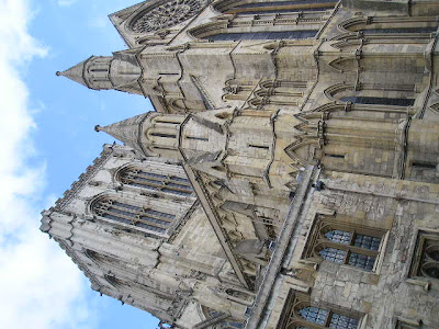
York Minster. One of the most amazing buildings I've seen. Being one of the largest gothic cathedrals the architecture is breathtaking in itself.

The minster has a cruciform plan with a chapter house attached at the back. The chapter house shows some of the best gothic sculture in the country, lined with sculptured heads, no two faces a-like. The carvings and sculptures lining the walls of this great building could keep you occupied for hours.


The stained glass showing different scenes are beutiful, despite restoring work taking place on many of them. The great east window displays the worlds largest area of medieval stained glass in a single window. Telling the story of the beginning to the end of the world as told by the Books of Genisis and Revelation.


Whilst sitting opposite this window I'd also like to point out that there are several graves under you marked by flagstones of members of clergy that died in battles etc. Very Chilling.

Another aspect of the cathedral you just have to see is the central tower, though there is one, small obstacle. Stairs, and lots of 'em, 275 to be exact, spiralling at a pretty steep angle, and roughly about 2ft wide.

Standing in the queue at the bottom, reading the various warning signs dotted at the entrance to the tower, thinking "ah they're just being over cautious" "Won't be that bad". Even the flushed, sweaty people returning from the previous trip, shaking their heads as they pass didn't even deter litle old niave me.

Grinning as we were let in, taunting my brother, I happily started to count the steps as we went, big mistake, I was soon rasping number '23' before realising i needed to shut up and save every last bit of energy I had for the next 242 steps. The pace is constant as theres people in front and behind of you, you cant daudle as theres simple no room to let anyone pass you. Roughly about 100 steps in, you come out in line with the 2 smaller towers, fooling you into thinking you had reached the top already. Instead your on a metal roof walkway barely able to fit one person width wise. If your not one for heights, it's painful.


Eventually after the longest 15 minutes of my life, my brother (whos 14) kindly pulled me up the last 10 steps into the fresh air to reach the top of the 234ft tower.
Was it worth it?
Just about!!.... the views across York were breathtaking (if you had any left after getting to the freaking top!) you could easily see for miles.

Heres some of the pics from the top, not half as scary as the ledge on the middle!!


Best bit of the tower?? My brother shaking from fright on the way back down... his right for gettign up there so easily!

York Minster is truly a magnificant building, which just shows the craftmanship and effort put itto building it in the 12th century. Well worth seeing.

Tuesday, 4 September 2007

Art of Wordplay

After reading 'Angels and Demons' by Dan Brown, I was fascinated by ambigrams. I'd never heard or seen any before so dug a little deeper. If you don't know what an ambigram is by the way... Its a word which can be read upside down, back to front an even inside out!


John Langdon created several stunning ambigrams for Browns book and for anyone whos read the book... Brown named a character after him as thanks! (Robert Langdon)
John Langdon started out as a graphic designer and has won serveral awards for his logo designs, and has since become famous for his ambigrams.
He even designed the 'trick and treat' card that derrren brown uses on his series.


In Langdons book 'Wordplay' there are plenty of ambigrams to keep you mesmorised for hours, and reading how Landgon got into this area is definatly worth a read.
I really think its amazing how someone can turn any word or phrase into a work of art in serveral styles, there are plenty of links and information available to give you tips on how to create them.

A few of my favourite of Langdons logo designs and amibgrams.


Ambigrams


This is one of my many favourites... reads flase one way, and truth the other.


Links

www.johnlangdon.net
www.ambigrams.co.uk
http://punya.educ.msu.edu/ambigrams/tips.html